
Chart Wizard
Select Chart > Chart Wizard to open the Chart Wizard, where you can dynamically edit the chart.
The following settings are available:
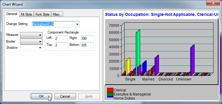
General Tab
| Element | Description |
|---|---|
Change Setting | Select a component within the chart to edit. A component can be a background, display, legend, title, label, or text panel. |
Measure | Select a unit of measure from the drop-down list. |
Border | Select a type of border from the drop-down list. |
Shadow | Select a type of shadow from the drop-down list. |
Component Rectangle | Enter the rectangular area size. |
Scope | Sets which rows and columns from the table data will be displayed. Enter the scope in the following fields:
|
Chart | Select the type of chart. |
Axis | Select the axis style. |
Show Zero | Select to display zero values in the chart. |
X Grid | Select to show x axis grid lines. |
X Ticks | Select to show x axis tick marks. |
Relative Index | Select to let display axis labels relative to the minimum value. |
Y Grid | Select to display y axis grid lines. |
Y Ticks | Select to display the y axis tick marks. |
Use Max Size | Select to limit the maximum value used to display the component to the value specified in the Max Size field. |
Fill Style Tab
| Element | Description |
|---|---|
Change Setting | Select a component within the chart to edit. A component can be a background, display, legend, title, label, or text panel. |
Fill Style | Select the background fill style. |
Angle Value | If you have selected the Angle fill style, enter the angle for the fill (0 - 90 degrees). |
[Resource Image] | If you have selected the Resource Image fill style, enter the full path to the bitmap image to use. |
For Resource Image Fill, use | If you have selected the Resource Image fill style, you can choose either to Stretch the image to fill the area, or Tile the image. |
Start Colour and End Colour | Use the Start Colour and End Colour buttons to to select the fill colours. If you select the Solid fill type, then only the Start Colour will be used. If you select the Horizontal, Vertical or Angle styles, then the fill will be a blend from the Start Colour to the End Colour. |
Font Style Tab
| Element | Description |
|---|---|
Change Setting | Select a component within the chart to edit. A component can be a background, display, legend, title, label, or text panel. |
Type Name | Set the font for this element. |
Size | Enter the font size. |
Auto Size | Select the Auto Size check box to automatically adjust the font size to fit the available space. |
Bold, Underline, Italic, Strike out | Select the check boxes to set the font style. |
Font Colour | Click to change the font colour. |
Alignment | Set the font alignment. |
Misc Tab
| Element | Description |
|---|---|
[Component] | Select a component from the drop-down list and click Add to Chart to add it to the chart. |
Use ScrollView | Select to attach a scroll bar to the preview display. |
Components Order | Use the buttons to rearrange the chart components. |
Show Content While Dragging | Select to display the content of the component when a component is moved. |
Show Grid | Select to display a grid on the chart. When you select this option, you can adjust the grid size and activate Snap to Grid. |